The rise of data slop


In its early days, Uber was famous for infighting, deliberately pitting multiple different organizations against one another. There were some upsides to this, but also many problems. Unfortunately, data was often a weapon.
At the time, we had weekly calls to discuss the state of the business with senior leadership. Why was growth accelerating in New York but stalling in Los Angeles? Was it something about the market? Something the Ops team had done? A failing piece of tech?
You had to have answers. So multiple teams would produce them — different sets of “facts” that conveniently aligned with their interests.
During these internal cage matches, I became familiar with a new kind of colleague: the person who’s downright dangerous with data.
They cherry-pick metrics, cut time series off at suspiciously selected dates, manipulate baselines, and tweak chart axes to support whatever narrative they're pushing. They excel at making their team look stellar, or making rivals look incompetent.
Fending off this person often felt like a full-time job. But back then, making data so disingenuous also took up a lot of their time and energy.
Now, a GPT prompt can do it in seconds. We’ve entered the era of data slop.
Do you know data slop when you see it?
We’re all familiar with AI slop. And most of us are pretty good at identifying it — we know that shrimp Jesus or mountain cabins made of airplanes don’t actually exist.
But data slop is a different beast. It looks like real data — because it is real data, usually. It’s just manipulated to support a specific narrative.
And it’s frighteningly easy to create. Let’s look at a few examples that we asked ChatGPT to come up with.
Example 1: Is crime in major US cities at an all-time high?
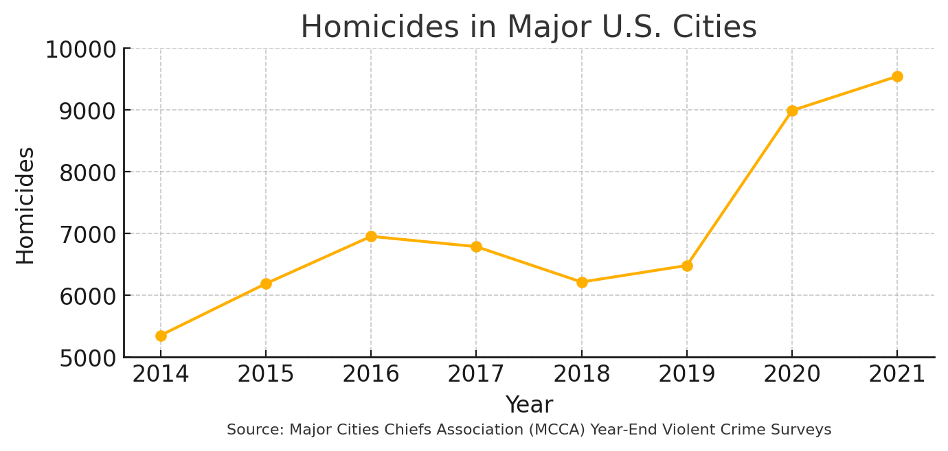
- Chart 1 shows only the years 2014‑2021 and chops off everything below 5,000 homicides, so the line looks like a nonstop surge — perfect for a dramatic “crime is at an all‑time high” headline.
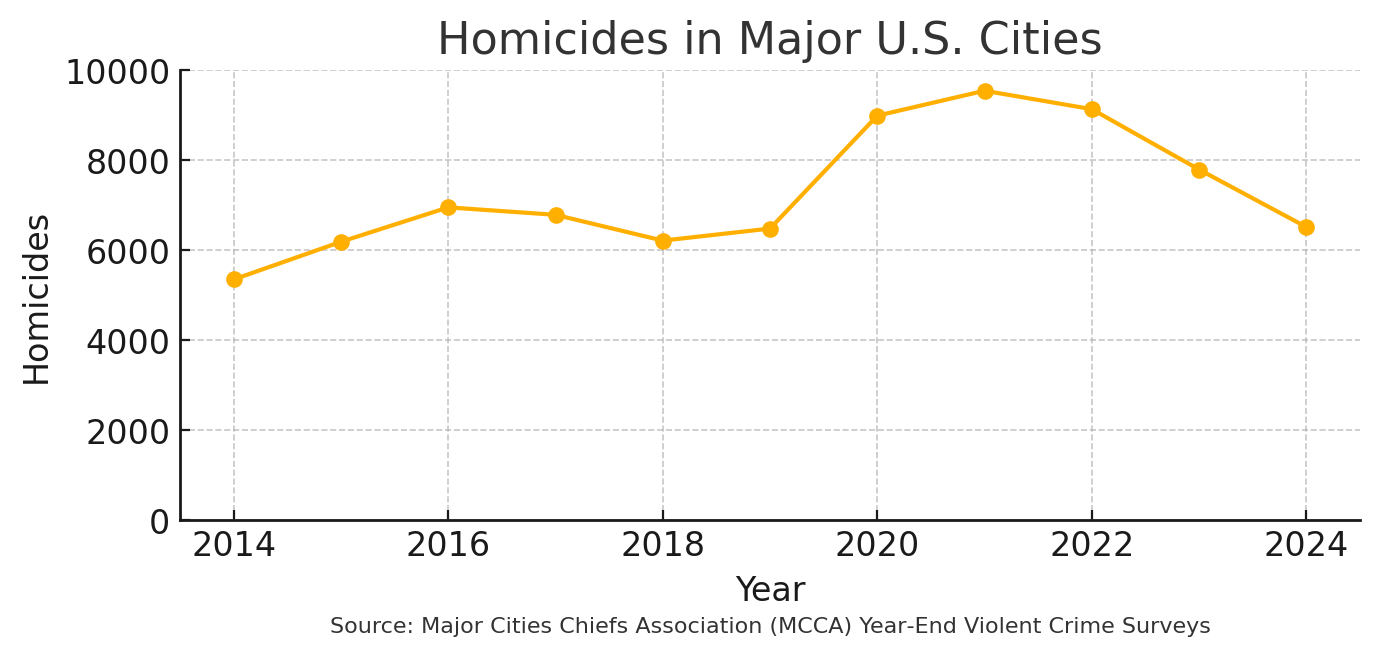
- Chart 2 keeps the full 2014‑2024 timeline and uses a zero‑based y‑axis. With those extra years included you still see the pandemic spike, but you also see a one‑third drop afterward, which undercuts that headline.
Both charts use the same MCCA year‑end homicide totals; the only difference is which years are plotted and where the y‑axis begins.
Example 2: Is renewable vastly more expensive than fossil fuels?
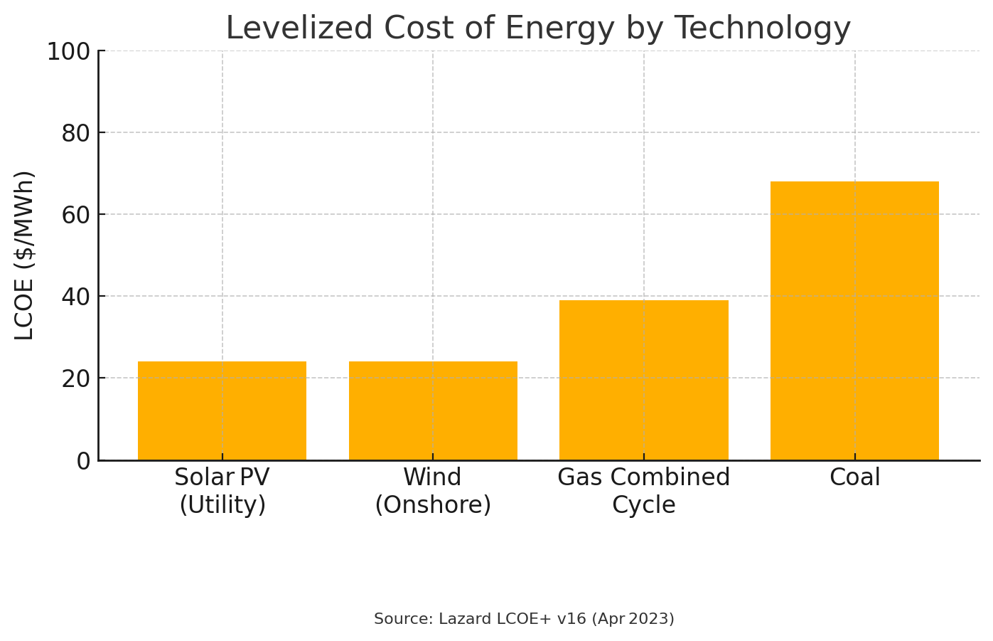
- Chart 1 uses the midpoint of Lazard’s unsubsidized cost ranges and a zero‑based axis. Utility‑scale solar and onshore wind come in at about $24/MWh, cheaper than combined‑cycle gas at $39 and coal at $68, so renewables look like the clear winner.

- Chart 2 picks the most expensive renewable options (rooftop solar at $117/MWh and offshore wind at $72/MWh) and the lowest fossil estimates, then starts the y‑axis at $30/MWh. That combination flips the story so fossil fuels appear cheaper.
The underlying data source is identical; the story changes because of which technology segments and axis limits are chosen.
Example 3: Are home prices more affordable now than during the mid-2000s bubble?
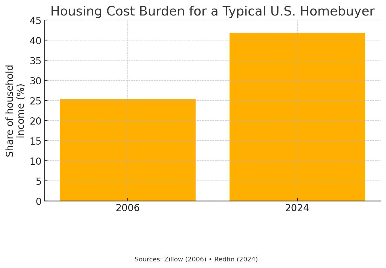
- Chart 1 plots the share of median household income needed for a mortgage on a median‑priced home. The burden jumps from 25 percent in 2006 to 42 percent in 2024, implying affordability has collapsed.
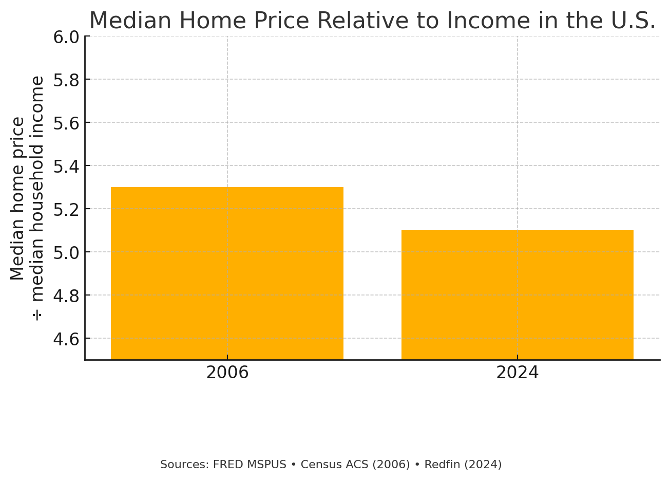
- Chart 2 switches to a simple price‑to‑income ratio and starts the y‑axis at 4.5 instead of zero. The tight scale flattens the difference, making the 2006 and 2024 bars look almost identical and implying affordability hasn’t changed much.
Both charts draw on the same national median price and income figures from Zillow, Redfin, and the Federal Bank of St. Louis; the narrative flips because of the metric change and the y‑axis scale.
These three examples show just how data slop works: massaging metrics, axes, and data sources can support whatever narrative you choose.
And we made all of them in less time than it takes to get a pizza delivered.
The perfect conditions for a slop storm
Let's be clear: it's not just the intentional data manipulators causing trouble. The democratization of data combined with powerful new AI tools has created a situation where even well-meaning employees can generate misleading analyses without realizing it.
Organizations are swimming in more data than ever before. There's immense pressure to extract value from this data deluge, especially as competitors tout their "AI transformation" successes. This race creates an environment where quantity often trumps quality.
Alongside vibe coding, we’ve seen the rise of vibe analytics — where anyone can simply ask an AI to "go find me this metric". The technical barriers to data analysis have been removed, without necessarily improving analytical thinking.
There are two problems here: the models powering these tools might get things wrong, and even when they don't, the analysis happens through whatever narrow lens the requester happens to have — which really matters when data literacy is low.
Meanwhile, our collective obsession with dashboards has failed to deliver on its promise. We thought giving everyone access to dashboards would create a data-driven utopia, but instead, we've created a world where teams build their own siloed views of reality without business context, measuring individual trees while missing the forest entirely.

Why is this happening now? Four factors have converged to create this perfect storm:
- Incentive misalignment – Quarterly targets and OKRs reward attention-grabbing charts, not rigorous analyses. Organizational incentives rarely favor the person who says "the data is inconclusive" or "we need more information before deciding."
- Democratized tooling – We've gone from Excel macros to GPT-powered analytics in the blink of an eye. Anyone can generate charts and reports in seconds, regardless of their understanding of the underlying data or statistical principles.
- Information overload – Leaders typically scan headlines and dashboards, and rarely (never?) scrutinize methodology appendices.
- AI hallucination & synthetic data – Today's AI models can fabricate entirely plausible-looking trends from noise. These synthetic patterns can slip past even experienced analysts, creating a false sense of confidence in decisions.
Of course, people have been cherry-picking data to tell their preferred story for decades. The practice itself isn’t new.
But we’re not just dealing with painstakingly assembled, deliberately misleading charts anymore. Today, anyone can generate sophisticated-looking reports that serve their narrative with minimal effort and maximum confidence. So we have to learn how to spot — and stop — them.
Spot the slop: Anatomy of a sloppy chart
For better or worse, I’ve had a lot of practice watching people torture data until it confesses to whatever they want. Here are the telltale signs of data slop I’ve learned to look for:

Pay attention. If someone’s switching up standard metrics, zooming in on time windows, truncating axes, or mixing segments — or if the finding simply seems too convenient or too good to be true — your data slop Spidey sense should be tingling.
The costs of data slop
All of this data slop creates real business damage — I've seen it firsthand.
The most immediate impact is simply “flooding the zone”. When your organization is drowning in charts and dashboards, no one has time to properly review or question them all.
Beyond the overwhelm, we also see:
- When data is weaponized to point blame, friction and mistrust develops between teams.
- When everyone’s energy goes toward defending territory instead of solving problems, productivity and innovation slows.
- When people catch onto the proliferation of data slop, trust in data erodes across the organization.
And when business intuition gets replaced by superficial metric-chasing, you have a real problem. As Stanford professor and causal ML expert Stefan Wagner noted on the High Signal podcast, "I think one of the worst mistakes you can do if you try to move an organization or a system into a more data-driven direction, is to throw away common sense and throw away things you already know."
Ultimately, the cost of data slop translates to:
- Strategic errors: Capital gets misallocated, product bets go sideways
- Credibility hits: Your board stops believing anything you present
- Talent attrition: Your best data scientists leave when they see their work weaponized
- Regulatory risks: Misleading disclosures lead to SEC, GDPR, or consumer‑protection actions
So what can business and data leaders do to slow the tide of data slop — without banning AI-powered analytics altogether?
How to manage the tidal wave
There are three cornerstones to slowing the rise of data slop: build data literacy, especially among leadership; create process and tooling controls for all analytics; and create a culture that values quality over quantity.
1. Build data-literate leadership
We can’t expect leaders to scrutinize methodology appendices. But we can train them to look for on-page footnotes on sources and methodologies in decks and reports — and treat their absence as an immediate red flag.
Consider running chart autopsy sessions in executive meetings. Deconstructing visualizations together builds the right muscles for spotting manipulations, and signals that rigor matters.
2. Implement process and tooling controls
Standardizing your metrics is a must. This involves:
- Establish a clear set of primary metrics that everyone reports against — such as average revenue per user (ARPU), versus variations like revenue per paying user or revenue per account.
- Add secondary check metrics that typically move in the opposite direction. For example, if conversion goes up but retention tanks, it’s clear that you haven't actually improved the business. Pairing these metrics creates a system of checks and balances that prevent cherry-picked success stories.
- More simply: insist on clear axis labels that spell out units and baselines. This basic standard goes a long way toward filtering out data slop.
Additionally, create a process for validating AI-generated outputs. For any mission-critical application, run parallel manual queries alongside your AI tools: set up a reproducible notebook or dbt test that rebuilds high-stakes metrics nightly; if today’s result deviates >X %, alert a human.
These systems are constantly changing under the hood, and what worked perfectly last month might be hallucinating today.
3. Create the right cultural norms
Dramatic charts tend to capture all the attention, but it’s crucial to create a culture that rewards teams for surfacing inconvenient truths.
Celebrate the messenger who points out the flaws in their own analysis. Treat "discovering you're wrong early" as a win, not a failure.
That level of intellectual honesty is worth its weight in gold — especially in a world of data slop.
Conclusion: fight the slop, not the AI
Organizations today are rich in data but still struggling to make it useful. Generating charts, dashboards, and reports is easier than ever, but it’s harder to know which ones to trust.
Start small: At your next staff meeting, pick one high-stakes dashboard and walk through this rubric together — you’ll be shocked at what you find.
If you want to up the stakes, pilot a data-review rubric in your next quarterly business review. Build clear standards for what constitutes acceptable analysis. Practice questioning results that seem too good (or too bad) to be true.
The answer isn't rejecting AI tools or gatekeeping data. Intelligent automation and democratization are powerful, and worth investing in. But you need to build the organizational muscles to separate signal from noise — and slop from substance.
Ready to unleash your data?
Discover how Delphina can transform your data science.